


The chart below shows the annual percentage change in the UK Consumer Prices Index (CPI) – January 2008 – October 2013.
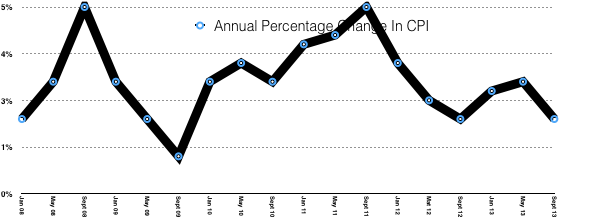
Which ONE of the following can be inferred from the chart above?
Select ONE answer:
- There was deflation in the UK economy between September 2008 and September 2009
- The CPI inflation rate was higher in September 2012 than in September 2009
- From January 2011 to January 2012, the average price level in the UK fell
- From May 2010 to September 2010, the cost of living in the UK fell
- From September 2011 to September 2012, the cost of living rose in the UK
Explain TWO limitations of using the CPI to measure the rate of inflation.
……………………………………………………………………………………………………………………………………………………………………………………………………………………………………………………………………………………
This is multiple choice question is suitable for Economics KS5 classes.
The answer is 2 – The CPI in September 2012 was 2%, whilst in September 2009 it was 1%

This work is licensed under a Creative Commons Attribution 4.0 International License.

You must be logged in to post a comment.